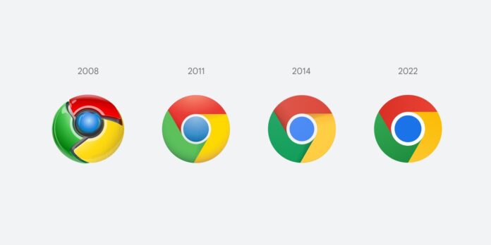
For the first time in eight years, Google is changing its Chrome browser logo, adopting a much simpler look. Elvin Hu, a designer for Google Chrome, offers a first look at the Google Chrome redesigned logo in a thread on Twitter. Although the changes are subtle, they can be spotted with a thorough examination.
Some of you might have noticed a new icon in Chrome’s Canary update today. Yes! we’re refreshing Chrome’s brand icons for the first time in 8 years. The new icons will start to appear across your devices soon. pic.twitter.com/aaaRRzFLI1
— Elvin 🌈 (@elvin_not_11) February 4, 2022
Breakdown of the Google Chrome redesigned logo
The new Google Chrome redesigned logo has brighter colors, a larger blue circle in the center, and no more shadows. Although, it’s got the same general scheme as the circular, four-color basic design. The company started making the change in its Canary test version of Chrome, but it’ll roll out to the developer, beta and mainstream releases in the coming weeks.
Read more: Google launches Chrome 90 with HTTPS as the default protocol
Another change that the company has introduced is OS-specific customizations. Google is redesigning the new logo with different variations designed to look more at home on Windows, MacOS, and iOS. Chrome designer Elvin Hu said in a tweet; “We want the icons to feel recognizably Chrome, but also well crafted for each OS.”
Google Chrome will mute noisy tans in one click
Google Chrome makes it easy to see which tab is making noise with the little speaker indicator, but muting the tab always required two clicks. Now, Google is going to change that, as the company is testing the ability to mute a tab with a single click. With the new update, the user can simply click on the icon once to mute the tab instead of right-clicking the speaker icon and then muting it.
Source: Verge


